Begin with the impression you mean to leave
Visual identity is the relationship between your choices, rather than a single colour, logo or editing treatment. A viewer may recognise the side light in your portraits, the generous space around your product photographs, or your habit of showing an unfinished application. Start by describing the experience you want to offer. “Precise explanations with an experimental edge” gives you more useful direction than “aesthetic beauty content.” It connects a look to a reason for following.
Write down three qualities and give each a visible expression. If the quality is candid, you might preserve texture and include working moments. If it is considered, you might use deliberate spacing and clear product labels. These are options, not universal rules. The important question is whether a stranger can see what you mean without reading an explanation of your brand.
Collect references without borrowing a persona
Build a small reference board from photographs, packaging, interiors and your own earlier work. Pinterest can help organise links, but the board should record where an image came from and what specifically interests you. “Soft fall-off on the cheek” is a useful note. “Make my page look like this person” is not. Separate the quality you admire from the subject, budget and identity of its original creator.
Keep private inspiration separate from material you may publish. Saving a reference does not give you permission to repost it, and credit alone is not a licence. When you share a moodboard publicly, use your own images, obtain permission or check the applicable licence. Your finished direction should make sense even when the source images are removed.
Choose a small set of visual anchors
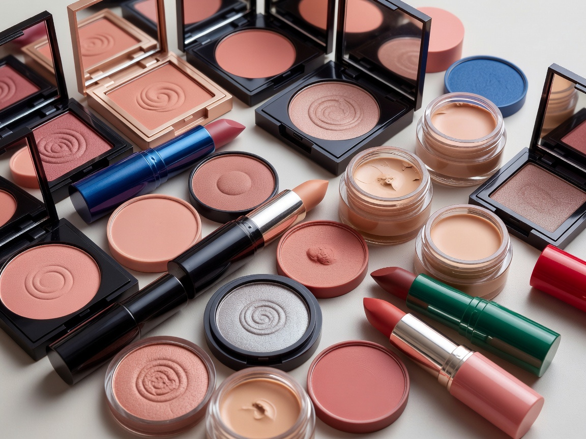
Try one light behaviour, one framing habit and one supporting surface. For example, you might pair directional window light with close crops and an uncoated neutral background. That leaves plenty of room for colourful makeup. A neutral set need not mean neutral artistry, and a colourful set need not mean visual noise. The anchors exist to help the subject remain readable.
Colour needs special care in beauty imagery because viewers may use it to judge a shade. A warm background can support your identity while an excessively warm edit misrepresents the product. Compare the photograph with the physical item under suitable neutral light. Avoid turning skin, whites and swatches into collateral damage for a cohesive-looking grid.
Less useful direction
“Everything must be beige, whatever the product or skin tone.”
More useful direction
“Keep the supporting surfaces quiet so the real shade and texture remain the subject.”
Make a one-page working identity sheet
Record the choices in language you could hand to a collaborator. Include a short purpose statement, sample light direction, background options, type hierarchy and a few approved crops. Add an “avoid” column for things that obscure your work: clipped highlights on shimmer, labels too small to read, or smoothing that removes the texture being discussed. Show examples from your own tests rather than relying entirely on borrowed references.
Editing applications such as Adobe Lightroom or Snapseed can help you save repeatable adjustments. Treat a preset as a starting point, not a final decision. Exposure and colour temperature vary between sessions. Correct the individual image first, then check whether the shared treatment still serves it. Keep an unedited original so a future revision does not depend on reconstructing lost information.
- One sentence describing the intended impression.
- Three visible anchors with your own example images.
- Clear limits for colour changes and skin retouching.
- A readable text treatment for small screens.
- A note explaining where variation is welcome.
Test recognition through a small body of work
Make a short set containing a portrait, a texture study, a product still life and an explanatory frame. View them together and separately. Ask someone what feels connected, what feels unclear and what they think the content will help them understand. This is a qualitative exercise, not evidence that an identity will improve reach. A familiar-looking set can still fail to communicate anything useful.
Keep the choices that survive different subjects and realistic production conditions. Let go of choices that only work in one unusually elaborate shoot. Your signature should make everyday decisions easier, not turn each post into a test of loyalty to an old moodboard. Review the sheet when your work changes, and allow the identity to become more precise as your point of view develops.